


These are just a few tips we try to use ourselves and recommend to customers, to help them improve the end user experience when using forms.
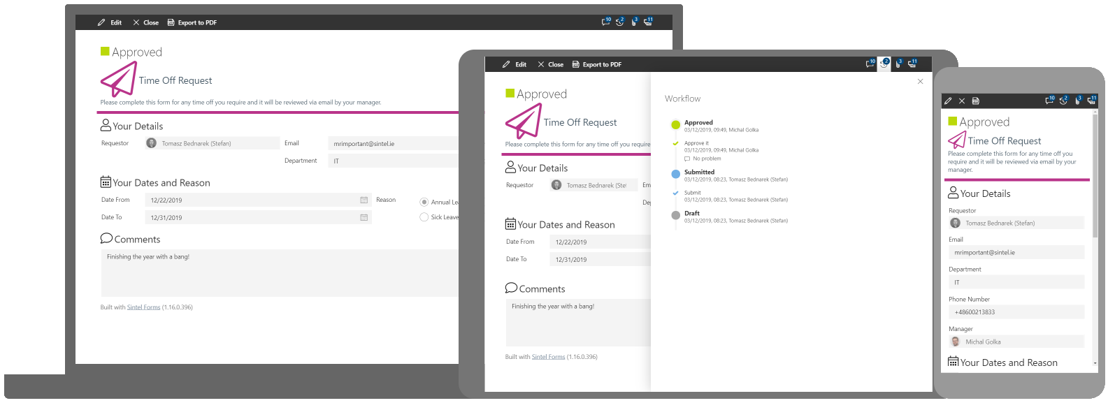
Note: The screenshot above is from an actual form which is available to download from our website, you can even try it out here.
- Use a Form title, description & icon
- Use sections to group fields
- Use tooltips & customise labels
- Is it really required?
- Use a notes or comments field
- Think mobile
- Printing
- Grammar
- Test test and re-test
It’s always a good idea to briefly explain what the form should be used for so it’s purpose is clear. Using a title, description and optionally an icon makes it much clearer.
It’s generally a good idea to separate the various kinds of info that is being captured on a form. For example we often capture the submitter’s data in a single section at the top of the form “the who” and then capture the actual form data “the what” in a secondary section.
If there is any possibility that a user could be confused about what should be placed in a field make sure to add a tooltip. These are great as they don’t clutter up the form UI however you can also add rich HTML into the form labels so the tips appear on-screen all the time rather than just when the hover over it with their mouse or tap on the tooltip icon.
This is an important one! If all fields are absolutely necessary, then make them required. A simple way to do this is to try and place all required fields within a single section and then make the section mandatory. Of course, this is not always possible depending on the design of your form. On the flip side of this, if a field is not required then maybe reconsider if it’s really needed i.e. try to avoid having too many optional fields on a form.
Invariably an end user may want to include some information on the form when they are filling it in that doesn’t fit into the fields you have added. By including a notes or comments field at the end of your form you give end users the possibility to add potentially useful information that otherwise wouldn’t be captured.
You need to consider the number of people that will use your form on mobile devices. It could be a 50/50 split between PC & Mobile or Mobile could account for 90% or more of your usage. End users expect modern forms to be responsive and work equally well across all devices so make sure your design meets this expectation by paying attention to the layout and how you group the data fields on it.
You might be lucky and your end users are not concerned about printing…it’s such a waste of paper! If however your end users want to print forms they have filled in it’s worth considering how the print layout will look. Most people will expect that if they print a form, the printed version should look identical to the on-screen version.
Double check and triple check your form design for typos. This is such a simple thing, but you wouldn’t believe the number of forms we see that have basic typographical errors. Typos are something that everyone experiences as it’s easy to hit the wrong key but not taking the time to re-check your design is a bad idea and trust me your end users will spot them ?
Never assume that the form design you have created will be easy for everyone to use, always get a second and third opinion as everyone thinks differently and a colleague may spot a design flaw or layout issue that you as the designer may miss.
These are just a few tips that we try to follow and recommend to our customers, if you have any others we would love to hear about them.
To learn more about Sintel Forms Studio check out our features.
For the latest updates follow us on LinkedIn/Twitter/YouTube.


0 Comments